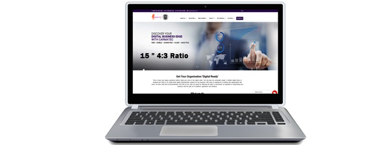
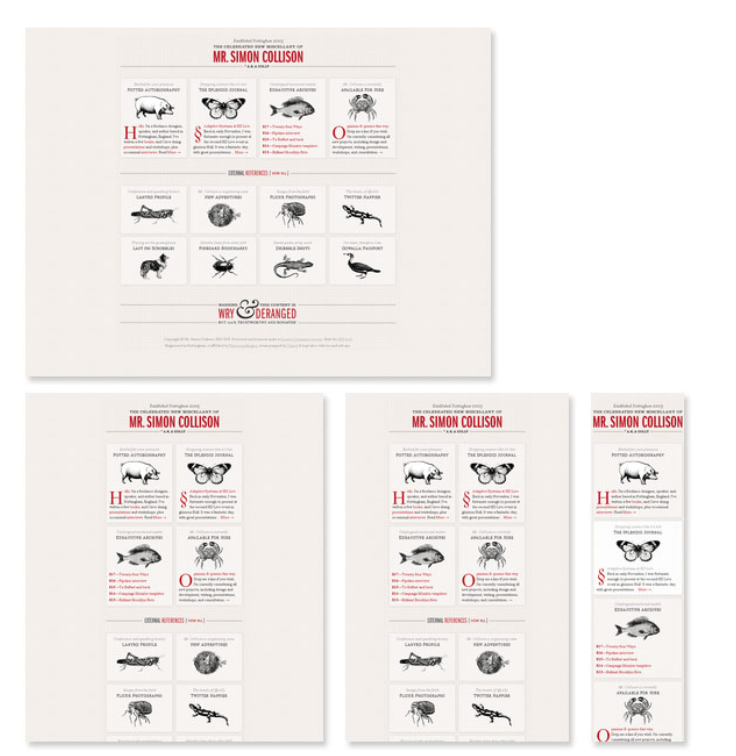
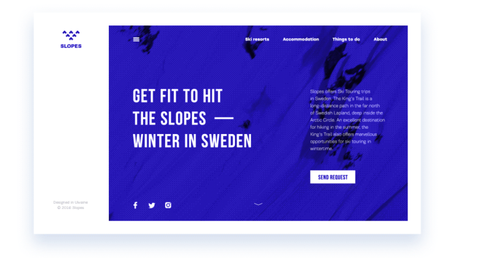
Today users view online content or do online transactions using various devices ranging from laptops, to tablet and mobile phones. Moreover, the mobile ecosystem (mobile devices and operating systems which are installed on them) is growing rapidly. Therefore, it is imperative that the websites which businesses build to target customers, are mobile optimized.
Mobile Responsive or Mobile Site
Two ways to make your website mobile optimized:
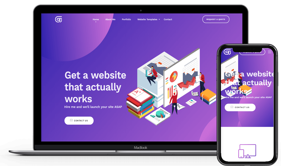
- Mobile responsive – Use a mobile responsive approach on the desktop website: a website which has a mobile responsive design will allow the same website to be viewed on different devices by adapting the layout and/or content based on the size of screen of that device.
- Mobile site – Build a separate website dedicated for mobile, taking into consideration all the aspects of different mobile platforms. Usually the mobile site will have a different URL from the main desktop site.
Using the mobile site approach can be costly to build and maintain because it involves building a different website, different URLs and different SEO work.
Using the mobile responsive approach is the trend nowadays because with today’s advancement in website development technologies, it is becoming increasingly easier and more cost effective to build website with mobile responsive layout instead of building separate websites for mobile.
From a user perspective, it is easier to remember a single URL to launch one website and view different layout of the same website content depending on the size of the screen.
Websites are viewed on desktops, laptops, tablets or mobile/smart phones. Desktop monitors can be of different aspect ratios (ratio of the width to height of the screen), ranging from 4:3 for standard screens to 16:9 for widescreen monitors.
Tablets also come in various sizes, from 7 inches like the Amazon Fire 7, to 12+ inches like the iPad Pro, passing through 8 inches (iPad Mini 4) and 10 inches (Samsung Galaxy Tab A).
With a mobile responsive design, the web content adapts to these different sizes or aspect ratios such that users can get a seamless experience when they switch from one device to another.
If your website is mobile optimized, your user or customer will have the following experience when viewing the responsive website on his mobile phone:
- The web content changes dynamically depending on the size of the mobile device e.g. the text size will change so that user can read the information comfortably.
- The Navigation is condensed such that the menu may appear from a button. E.g. Simplified navigation that is “thumb” friendly with large touchpoints, especially for critical contact information
- All the images are optimized so that they are rendered as quickly as possible on the device.
- The content appears with correct padding and spacing.
- All the features that are available on the desktop site are properly seen on the device and can be used successfully on the mobile device.
- The web content has reduced graphics such that critical information about products and services are seen in a user-friendly interface.
- Little need to type unless necessary.
Advantages of mobile responsive web design for your website, from a user’s perspective:
- Your users can share and link to your content using a single URL.
- Your users can more easily find your website in their search results.
- There is lower risk that your users will encounter common mistakes that affect mobile sites. These may include:
- Unplayable content (videos not playable on mobile phones)
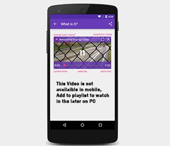
- Faulty redirects in case each user is redirected to desktop URL instead of the mobile version URL.
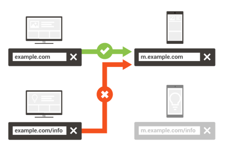
- Links which do not work on mobile leading to 404 error user experience.


- There is lower risk that your users will wait a long time for the page to load on a mobile device because no redirection to the mobile site is needed.
Mobile Responsive Website Best UI practices:
To get your customers to experience the best user experience on your mobile responsive website, the website must be implemented by taking into consideration the following best practices:
Flexible
A mobile responsive design allows the content to adapt to the device. However, a user might not enjoy a good experience viewing a website page on mobile if it goes on and on. Therefore, the mobile responsive design should be made flexible such that content can be prioritized and hidden for a better mobile experience.
Responsive Imagery
A good responsive design also includes making the images responsive. If images are not responsive, users will see a big picture but will not see the details correctly. To fix such art problem errors, a responsive design should use different cropped images when targeting different devices.
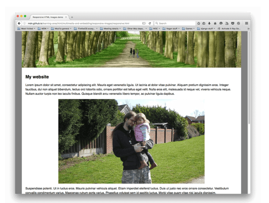
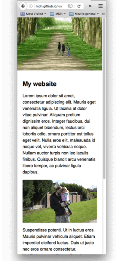
A good responsive design should also cater for smaller images for smaller resolution devices.
Minimalism matters
A mobile responsive design should have the characteristics of minimalism. The website when viewed from a mobile device should not only be free of unnecessary features or elements but should limit to flat patterns and textures and limited or monochromatic colors.
Standardize Clickable Areas/Buttons
For a good user experience, buttons and links should be large enough to accommodate finger click instead of mouse click.

Think Typography
Your mobile responsive design should make your content easy to read and truly optimized for the device size. Typography should be used to show hierarchy or attract the user’s interest. Using the correct size headings can help create great hierarchy on pages and the correct font size for modern device screen sizes can all create very engaging experience for your users.
With shopping and social media via mobile on the rise, a mobile responsive design, if effectively implemented, on your website, can influence user experience and engagement thus creating potential leads or customers for your business. Moreover, mobile responsive websites provide better search rankings. In addition, nowadays building and maintaining mobile responsive websites provide better return on investment than ever before due to the huge profit potential through digital marketing. For these reasons, do not waste time! Invest in mobile responsive websites for your business now!
Carmatec is a Digital Transformation Partner which takes up many projects with key focus on user interface design. You can see our project portfolio at https://dev.carmatec.com/portfolio/

